Home
- POV-Ray Tutorials
POV-Ray Introduction
Content - INDEX
1. Working with POV-Ray:
"Insert Menu Add-on".
2. Basics on
How To Make a Scene.
3D Coordinates,
Floats and Vectors
3. Scene Structure
Basic example.
4. Scene File Header,
#include files,
camera, light_source.
5. Basic Geometric Objects
sphere, box, cylinder,
cone, torus, plane.
and other shapes
6. Transformations
Streching, Turning,
Moving and others.
CSG: union,
difference, intersection.
>7. Colors on Surfaces
texture, pigment, normal, finish
8. #declare, #local, #macro,
placeholders + flexible objects.
9. #while Loops
Basic examples.
10. #include, include files,
re-usable objects.
11. Efficiency,
speed, flexibility,
modulare working
adapting from 3.1 to 3.5;3.6
adapting from 3.5;3.6 to 3.7
POV-Ray + Windows Vista.
- Insert Menu Add-on
& Download
|
The Designing of the Surfaces
- the Texturing of Objects
( Coloration, simulated deformation, brightness and shining of the surfaces.)
texture{ } is a container for the qualities of the surface of an object.
A texture basically has the following components:
pigment{ } The color and the transparency.
normal{ } The roughness of the surface.
finish{ } The brightness and reflection quality.
Example:
texture{ pigment{ color Orange}
         normal { bumps 0.5 scale 0.05 }
         finish { phong 1.0 reflection{0.2} }
} |
The statements "pigment{...}", "normal{...}" and "finish{...}"
can be used as stand alone statements (without being inserted in a "texture{...}" statement),
but for keep the structures clear it's recommended to put these things together a container "texture{...}"!
|
|
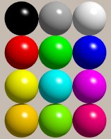
pigment{color ... } - Color (must!) and Transparency (optional!)
As long as you have added the line on the top of scene text #include "colors.inc",
you may use predefined colour expressions with English color names as an abbreviation:
e.g.: pigment{color Red}
It's possible to define any kind of color you want by mixing red, green and blue light
(additive mixing of colours!),
for this we use the statement for rgb-colors: pigment{color rgb<..,..,..>} (red,green,blue).
The numbers between the brackets are expressing the intensity of each component by float values
between 0.000 und 1.000 . Where 1.000 = 100% and 0.000 = 0% of the according colour component.
Examples for rgb colors:
color rgb<0,0,0> = black (you may also write "color Black"),
color rgb<0.5,0.5,0.5> = grey ("color Grey"),
color rgb<1,1,1> = white ("color White"),
color rgb<1,0,0> = red ("color Red"),
color rgb<0,1,0> = green ("color Green"),
color rgb<0,0,1> = blue,("color Blue"),
color rgb<1,1,0> = yellow, ("color Yellow"),
color rgb<0,1,1> = a greenish light blue called cyan,
color rgb<1,0,1> = a violetish red called magenta.
color rgb<1,0.65,0> = a warm orange yellow,
color rgb<0.25,1,0> = a yellowish green ("color YellowGreen"),
color rgb<1,0,0.25> = a violetisch red.
Further more we can dim and brighten colors:
color rgb<1,0.5,0.5>= light red
color rgb<0.5,0,0> = dark red,
|
|
It's a good idea to take some simple spheres and to try it out by yourself!
Human eyes can see about 16 millions different colors. This needs 24 bit per pixel for a representation in computers!
Check your monitor settings: it should be at least by 24 bit colors ('true-color'). The factory setting is often less
(16 bit or 'hight colors') - no problem with most computer games, but with POV-Ray you'll see the difference!
Behind the statement #include "textures.inc"
you can use
all predefined color patterns (pigments) and predefined textures declared in this file.
Example predefined pigment:
texture{ pigment{ Jade }
          finish{ phong 1.0 }
} |
Other predefined pigments are e.g.:
Candy_Cane, Red_Marble, Brown_Agate.
|
Example predefined texture:
texture{ Cork
         finish{ phong 1 }
} |
Other predefined textures are e.g.:
Polished_Chrome, Polished_Brass.
|
Jade
|
Transparent materials with refraction:
For e.g. thick glass we need "interior{ }":
material{ texture{ ... }
          interior{ ior 1.5 }
} // end of material |
|
Example predefined material:
|
Glass
|
normal { ... } - The Roughness of the Surface (optional!)
If the roughness is not defined the surface will appear smooth.
Some of interesting effects that can be defined by the normal statement:
bumps, waves, dents, ripples, wrinkles. |
|
If you try it out and the effect seems to fail (no change to see!) so in most cases this
will be because e.g. the bumps do only one bump on a square of 1 x 1. If you scale it down e.g.
by "normal {bumps 1 scale 0.05}" or something like that, this problem mostly
will be solved.
It is important to know, that all these deformation defined by "normal { ... } are
only simulated surface deformations by a more or less rhythmic tilting of the surface normal.
But because it is only used to calculate the reflections, this does not really deform the
shape of the geometric object. So the silhouette of these objects will stay totally smooth.
As a consequence of this, the deformation of the surface by this method is limited to those
cases, where this not deformed outline of a bumpy object does not spoil.
In those cases we can design very fascinating realistic surfaces by this simple
(and mostly very fast) trick.
finish { ... } - The brightness and the Reflection (should be defined!).
The most important values are:
(With POV-Ray 3.6.2: Use the statement "global_settings {assumed_gamma 1.0 }"
at the top of your text!)
ambient 0.10 This is the brightness of indirect illuminated surface parts (should be defined!)
(This simulates only the effect of indirect illumination, to calculate it a little bit more correctly
we can simulate it by the so-called ":radiosity": - a totally correct calculation of it is nearly
impossible!)
diffuse 0.90 This is the part of the brightness of the surface which is caused by the directly
hitting illumination!
reflection 0.15 This is the reflection component of the light we see coming from an
object.
phong 1.0 A simple form of simulating highlights on a surface.
|
|
 !!! Remarks: !!! Remarks:
The POV-Ray defaults are: (Version 3.5, 3.6): "finish { ambient 0.1 diffuse 0.6 }".
On computers with Intel's (486, Pentium etc.) in this way the colors appear much too dark!
It's recommended on these systems to increase these values up to
"finish {ambient 0.10 diffuse 0.9}".
I can highly recommend to fix the values of diffuse and ambient in general way with the instruction
#default{ finish{ ambient 0.1 diffuse 0.9 }} |
at the beginning of a scenery description
and change these values only for e.g reflecting surfaces.
If you want an object to appear with more contrast between dark parts (deeper shadows) and shining parts
so you should keep in mind that the sum of ambient, diffuse and reflection should be 1 = 100 % for realistic
viewing. So while decreasing ambient we should increase diffuse e.g. "finish {ambient 0.05 diffuse 0.95}".
|